-
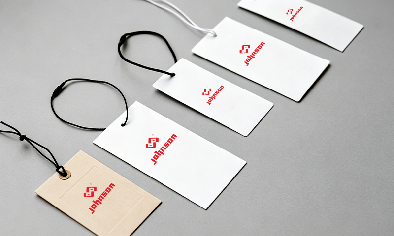
About Us
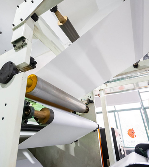
Why Choose Us?We are equipped with advanced high-speed adhesive coating lines, boasting a monthly production capacity of 20 million square meters. These machines support both hot melt and acrylic adhesive applications, enabling us to ensure fast delivery and consistent quality while meeting the diverse needs of the market. Our sales team works closely with you to fully understand your specific requirements.
 Coming From China, Marketing To The World.
 -
Solutions
Professional Label Material SolutionsAt Johnson, we understand that every industry faces unique labeling challenges. With 20 years of specialized expertise and strong R&D capabilities, we provide more than just materials — we deliver customized solutions that ensure “process compatibility, scenario suitability, and rapid delivery.
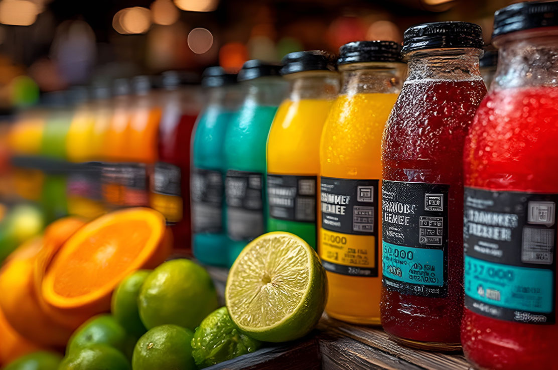
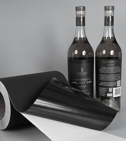
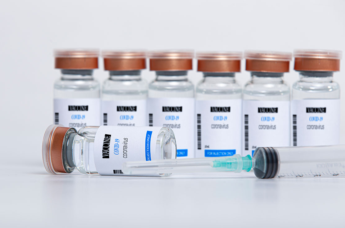 Eco-Friendly Labels, Zero Compromise on Quality
 -
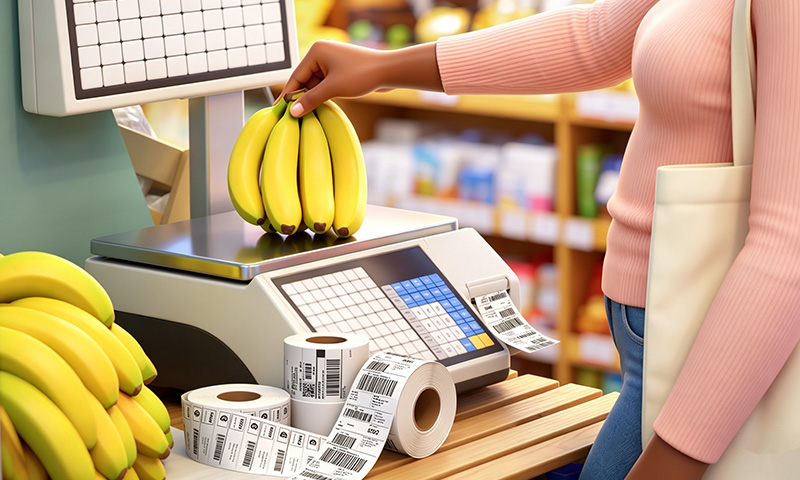
Products
SustainabilityIn the field of non-dry adhesive label materials, we don’t just "produce well"—we go further with environmental protection as our technical and ethical responsibility, turning every label into a "sustainable" carrier.
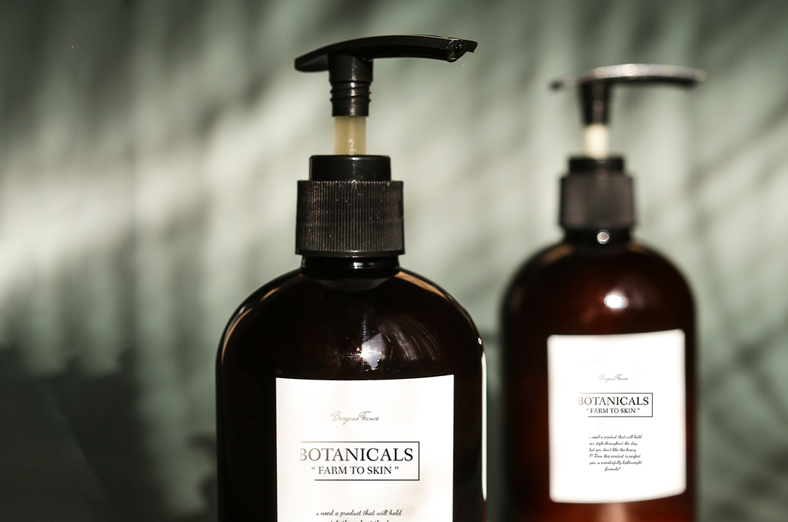
 Eco-Friendly Labels, Zero Compromise on Quality
 -
News
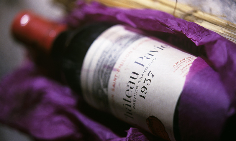
 Wine Labelstock Invites You to Labelexpo Asia 2025
From December 2 to 5, 2025, Labelexpo Asia 2025, one of the most significant events in the global label and packaging printing industry, will take place at the Shanghai New International Expo Center. ...
 English
 русский
 Español
Wine Label Dimensions: Standard Sizes for 750ml Bottles
Content
Standard Wine Label Dimensions for a 750ml Bottle
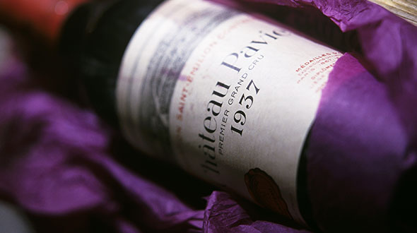
A front label on a standard 750ml wine bottle typically runs 3.5 to 4 inches wide by 3.5 to 4 inches tall, with 4" x 3.5" being the size most printers and design templates default to for maximum compatibility across Bordeaux and Burgundy-style bottles. There's no single legally mandated size — the number is a practical convention shaped by decades of bottle geometry, not a regulation.
Back labels usually run a bit taller than they are wide, generally 3 to 4 inches wide by 3.5 to 4.5 inches tall, since they need to fit mandatory text — alcohol content, government warning, bottler address — alongside tasting notes or brand story. Some producers size the back label smaller than the front (2" x 3" or 3" x 3") to create visual contrast between the two panels.
Common Wine Label Sizes by Placement
| Label Type | Typical Width | Typical Height |
|---|---|---|
| Front label | 3.5–4 in | 3.5–4 in |
| Back label | 3–4 in | 3.5–4.5 in |
| Neck label | 1.5–3 in | 0.5–1.5 in |
| Full wrap | 7.5–8.5 in | 3.5–4 in |
Bottle shape shifts these numbers more than volume does. A Bordeaux bottle's straight sides give a generous, forgiving rectangle to work with. A Burgundy bottle's sloped shoulders push labels shorter to avoid wrinkling on the curve. A tall, slender Riesling or Alsace bottle usually calls for the opposite proportion — narrower and taller, often closer to 3" wide by 5" high.
Designing a Wine Label: Bleed, Template Size, and Print Setup
Every wine label template needs three layers built in from the start: the artwork itself, the die-line marking the exact cut shape, and a bleed area — usually 1/8 inch (3mm) — extending past the die-line so background colors and images don't leave white edges after cutting. Skipping the bleed is one of the most common reasons a first print run comes back looking unfinished.
- Measure the bottle's actual flat panel before finalizing a size — don't design to a generic template first
- Set the file at 300 DPI minimum for print-sharp text and fine barcode lines
- Build in the 1/8" bleed on all sides and keep critical text inside a safe zone away from the die-line
- Leave dedicated space for mandatory text — alcohol content, net contents, government warning — separate from decorative copy
- Print a paper mock-up and wrap it around the actual bottle before ordering a full run
Mandatory type size matters more than most first-time designers expect. In the U.S., the TTB requires the government health warning to be printed no smaller than 2mm high on standard bottles, and alcohol content must be at least 1mm high for wines between 7% and 14% ABV — figures worth locking in before laying out the rest of the design.
Color and Contrast on a Red Label Wine Bottle
Red wine labels carry a specific design tension: warm reds and deep burgundies on the label can visually merge with the wine's own color showing through clear or lightly tinted glass, especially on a front label with minimal white space. Designers commonly offset this by pairing a red palette with strong neutral contrast — cream, gold foil, or matte black — so text stays legible against the bottle rather than blending into it.
Label stock and finish influence this further. A matte or uncoated stock tends to soften a red label's visual weight for a rustic, small-producer look, while gloss or foil accents push toward a premium, higher-shelf-price impression — a distinction worth deciding on before dimensions and layout are finalized, since finish can affect how much fine detail the label can hold at a given size.
Your email address will not be published. Required fields are marked *


Contact Details
TEL: +86-15626470581
E-mail: sales@szjohnson.com
Location
Address: Building 1, Room 201, Zhijianeng High-tech Park, No. 65 Hongyin Road, Lihu Community, Xinhu Street, Guangming District, Shenzhen 518107, Guangdong Province, China
Get In Touch
Copyright © Shenzhen Johnson New Materials Co., Ltd. All Rights Reserved.
Wholesale Self Adhesive Paper Manufacturers Adhesive Label Roll Factory